
Gaia's first Hertzsprung-Russell diagram
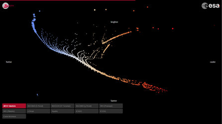
This graph shows the absolute luminosity of almost one million stars observed by Gaia as a function of their colour. Astronomers call it a ‘Hertzsprung-Russell diagram’, named for the two early 20th century scientists who recognised that such a diagram could be used as a tool to understand stellar evolution.
The diagram is based on a combination of data from Gaia's first year of observations and earlier data from ground-and space-based telescopes.
To estimate a star's true brightness or ‘absolute luminosity’, astronomers need to know its distance. Distances are estimated from parallax, the apparent motion of a star against a distant background observed over the period of a year and resulting from the Earth's real motion around the Sun; this is also observed by Gaia as it orbits the Sun alongside Earth.
But parallax is not the only movement seen by Gaia: the stars are also really moving through space, which is called proper motion.
Gaia has made an average of roughly 14 measurements of each star on the sky thus far, but this is generally not enough to disentangle the parallax and proper motions. To overcome this, the scientists have combined Gaia data with positions extracted from the Tycho-2 catalogue, based on data taken between 1989 and 1993 by Gaia's predecessor, the Hipparcos satellite.
The luminosity measurements are based on data from Hipparcos and ground-based telescopes, and the colour information comes also from ground-based observations.
This preliminary diagram provides a taste of what the mission will deliver in the coming years. Later it will be possible to compile a ‘Hertzsprung-Russell diagram’ based on the Gaia data alone.
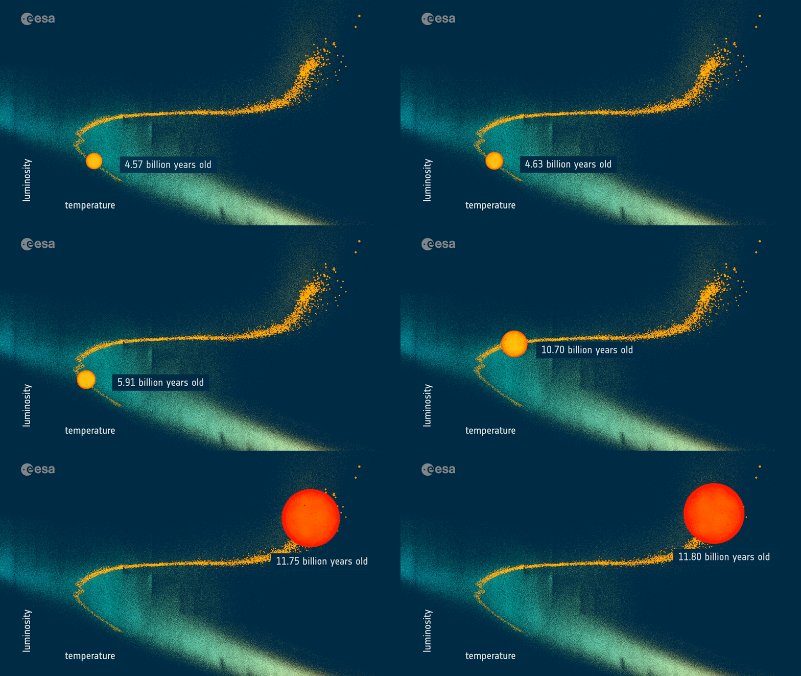
The data points appear to populate some characteristic regions of the diagram, with most of them distributed along the diagonal running from the top left corner to the bottom right: this is called the main sequence of stars, identifying all stars that are burning hydrogen in their cores – a phase that takes up the majority of a star's lifetime. Along the main sequence, brighter and more massive stars are located towards the top left of the diagram, whereas stars with lower masses and brightnesses are found towards the lower right.
The large clump of data points in the right half of the graph identifies red giant stars: these are evolved stars that have exhausted hydrogen in their cores. As their cores collapse under their own weight, the outer layers of these stars inflate, creating large and cool – thus red – envelopes.


