The iriss name and logos
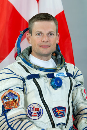
ESA astronaut Andreas Mogensen’s mission to the International Space Station is called iriss. The name was chosen from over 700 suggestions received from across Europe.
The name combines Iris and the International Space Station ISS. Iris was a Greek goddess, the messenger of the gods of Olympus and the personification of the rainbow. As messenger, she represents the link between humanity and the cosmos, and between the heavens and Earth.

The name also combines the rainbow – a symbol of peace – with Andreas’s scientific and technology demonstration mission to the Space Station.
The winning proposal was submitted by Filippo Magni, from Italy.
Andreas commented at the announcement of the name: “Science has been a bridge between East and West, helping to foster peace and understanding. The name iriss perfectly captures this aspect of the International Space Station.”
Filippo Magni is a student of aerospace engineering at Politecnico di Milano. He has always been passionate about space and, as a child, was fascinated by the gorgeous pictures coming from interplanetary missions and the Hubble Space Telescope.
“The rainbow is a universal symbol of peace and I like to think of the Space Station as a rare and outstanding example of peace and international cooperation,” says Filippo.
“The figure of Iris the messenger matches the role of the astronauts who have the task of transmitting their special experience in orbit to those who remain here on Earth.”
iriss logo
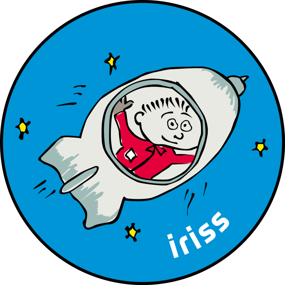
Unlike other ESA astronauts, Andreas Mogensen’s iriss mission has two logos, one to highlight the overall mission and one for the educational programme.
A competition in Andreas’s home country of Denmark attracted 500 entrants, with two designs chosen by an expert jury to represent iriss and Andreas.
The winner for the mission logo, Poul Rasmussen, was inspired by the Greek goddess Iris, who is often depicted with wings. The wings in the design also represent a Viking ship as used to explore the world and seek unknown horizons.
The iriss name is written in two colours to highlight that Andreas is leaving Earth for the International Space Station. Stars and planets appear above the name in stylised orbits.
His educational logo was designed by 19-year-old Louise Nielsen, who adopted the same colours as the mission logo, but the design shows a cartoon-style Andreas heading into space in a rocket.





 Germany
 Austria
 Belgium
 Denmark
 Spain
Spain
 Estonia
 Finland
 France
 Greece
 Hungary
 Ireland
 Italy
Italy
 Luxembourg
 Norway
 The Netherlands
 Poland
 Portugal
 Czechia
 Romania
 United Kingdom
 Slovenia
 Sweden
 Switzerland


