Logo draws on artistic talent
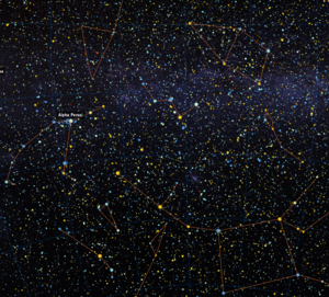
As Claudie Haigneré wished, CNES approached women designers to create the mission logo. Artist Virginie Enl’art was chosen. She used a symbolic combination of imagery, starting with the Andromeda constellation itself and using the chains which bound the princess to a rock (from which she was freed by Perseus) as an echo to the DNA chain.
The central figure (a cave-dweller from the valley of the Tagus) is a woman, signifying how far we have developed in 4000 years – her silhouette even hinting at what a spacesuit might be!
The background is taken from a terracotta spindle whorl, evoking the form of high-precision instruments like satellites, the structure of the Space Station, geometrical diagrams and mathematical equations.
According to Enl’art, the colouring adds further weight to the various elements – gold is consciously shaped to a crescent moon, yellow to the Sun with its trailing eruptions, light blue is reminiscent of the Earth’s atmosphere as seen from above, dark blue brings a hint of coolness, suggesting the dark void of the upper atmosphere and wider Universe, the red links the typography to the main character and the dynamism of the mission, and silver denotes the high technological aspect, at the very heart of this adventure.





 Germany
 Austria
 Belgium
 Denmark
 Spain
Spain
 Estonia
 Finland
 France
 Greece
 Hungary
 Ireland
 Italy
Italy
 Luxembourg
 Norway
 The Netherlands
 Poland
 Portugal
 Czechia
 Romania
 United Kingdom
 Slovenia
 Sweden
 Switzerland


