Hera gets its own logo
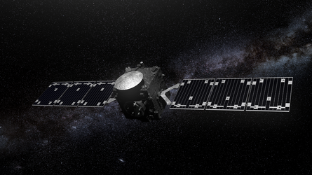
ESA’s proposed Hera mission will be humankind’s first visit to a binary asteroid system. Due to launch in 2023, the spacecraft will survey the little 160-metre diameter moon of the 780-metre diameter Didymos asteroid.
With a new mission comes a new logo. ESA mission logos are designed to display mission objectives whilst also incorporating the ESA branding. To ensure consistency across ESA, new logos follow a certain style, with guidelines on the layout and colour scheme. These branding guidelines were developed by digital experts Publicis Sapient.
Following these guidelines, the logo for Hera was designed by Italian design company, ReMedia. ReMedia first dug out the key elements of the Hera mission: protection from asteroid impact, modelling binary asteroid systems, prevention of asteroid collision, and development of new technology.
The logo creators combined these elements into the design, which depicts the main aspects of the mission. It shows Hera and two CubeSats surrounding the crater left by NASA’s DART spacecraft on the smaller of the two asteroids. The CubeSats will be released close to Didymoon; their capability to take more risks and fly closer to the asteroid will allow them to study the asteroid close-up. They will both carry a suite of state-of-the-art science instruments.
ReMedia chose to use simple geometric shapes to keep the design balanced whilst still being able to describe many aspects of the mission. The colours were also chosen for a reason; the dark blue of the central circle portrays the depth of space, whilst the brighter blue circle represents ESA’s Space Safety & Security efforts.
Space Safety & Security is one of ESA’s four pillars of space activities, each of which has its own colour scheme. ESA’s Corporate Design and Graphics Unit work with partners to streamline ESA’s visual communications across these four pillars.
Hera will be presented to Europe’s space ministers at the Space19+ Ministerial Council this November.


 Germany
 Austria
 Belgium
 Denmark
 Spain
Spain
 Estonia
 Finland
 France
 Greece
 Hungary
 Ireland
 Italy
Italy
 Luxembourg
 Norway
 The Netherlands
 Poland
 Portugal
 Czechia
 Romania
 United Kingdom
 Slovenia
 Sweden
 Switzerland


